Websites are a necessary part of business these days. If you don’t have one, you are likely missing out on the millions of people everyday who use the internet to search for what they need.
If you don’t have the money for a full website, you might consider a starter website.
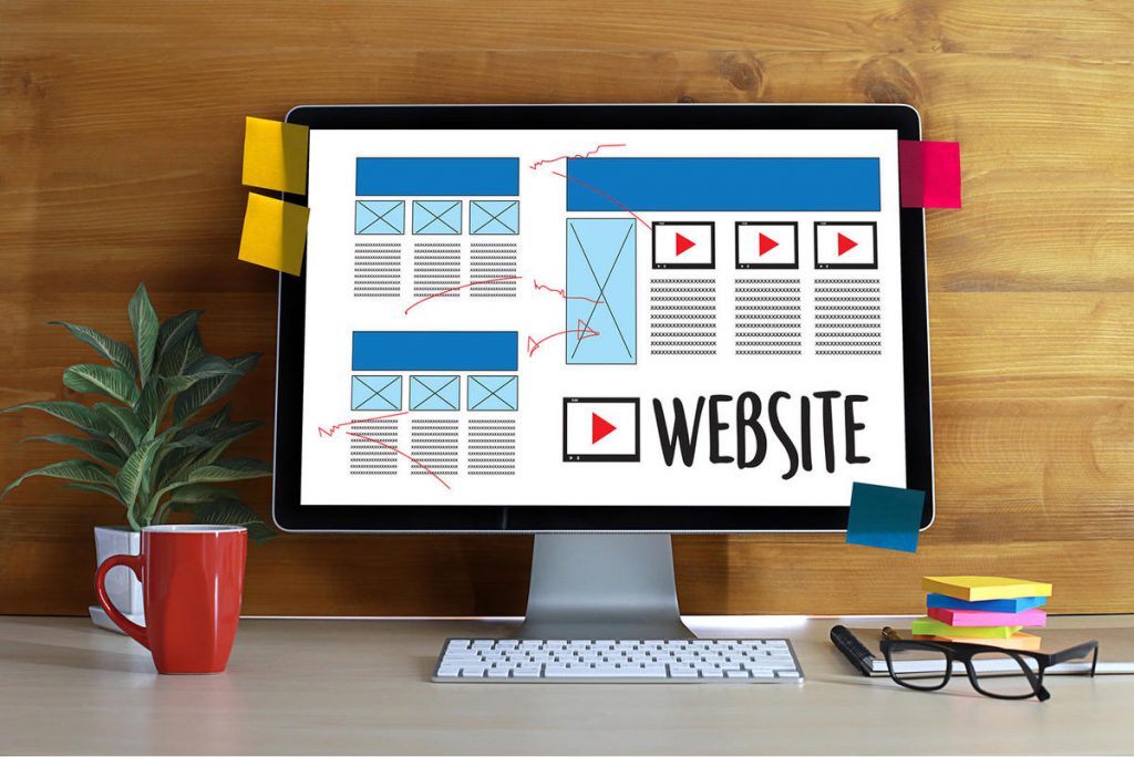
A starter website is basically a one-page site that covers all the important information of your business.
They can hold quite a lot of information if you want them to. Some starter websites might take you 5 or 6 full screen scrolls to even get anywhere.
Starter websites are much cheaper than a normal website and are great for getting a web presence established when you’re first starting out, rebranding, or just don’t have a lot of cash.
They often don’t have the same functionality as a full website so contact forms, commerce items, and multimedia might not be options for you straight away but that’s okay. As long as your starter website includes the essentials listed below, you’ll be fine.
So what should you put on your starter website and how should you organise it?
Here are six essentials!
WHAT YOUR BUSINESS DOES
It should be immediately obvious to anyone who comes to your website what you do. Whether that’s through your business name, logo, tagline, a relevant image, a video or a block of text, what you do is the first thing most people will check to ensure they are in the right place.
If you’re like me and have a cutesy, puntastic business name, you need to spell it out. Not everyone has the time or energy to Sherlock Holmes your website. They want to know something and they’re not there to solve a mystery. Be upfront.
WHO YOU ARE
As much as you might cringe about it, you and your team are probably going to have to get out from behind the desk and pose for a photo. People make buying decisions when they know, like and trust you. They can’t do that when they have no idea who you are.
You don’t have to go in-depth but a photo of the team, at your workplace with a quick overview of who you are, what you do and how long you’ve been doing it is plenty. If you can, tie in why all of that stuff will help your customer.
And if you’re a sole trader? Yep, it’s just you. CHEESE.
YOUR PRODUCTS/SERVICES
This doesn’t have to be an exhaustive list of everything you do but an idea of what services you have available will help people decide if you’re what they are looking for. A heading and a sentence or two of information per product/service is more than enough on a starter website.
If you only offer a single product or service then this is your chance to really sell it.
AN INDICATIVE PRICE
My Dad always says, “if you have to ask the price then you can’t afford it.”
Don’t let your potential customers slink away thinking you’re too expensive. Tell them what to expect so they can budget accordingly. Even something as simple as “websites from $1200” or “handmade jewellery starting at $10.”
The chances are that someone who wants to know the price is not going to bother asking. Tell them!
SOME SOCIAL PROOF
Social proof is anything that shows your customers that you are who you say you are and that you do what you say you do. Think testimonials, reviews, awards and nominations, press clippings, memberships, case studies with results – anything that tells your potential customer that they can trust you to do good things with their hard-earned cash.
If you don’t have anything to use as social proof, then it’s time to contact previous customers and ask them for a review. If you don’t have any customers yet, then reviews about you and your skills will work. Has anyone endorsed you on LinkedIn? Have you won any awards in previous jobs? Are you a member of a professional association?
This section will constantly be a work-in-progress as you get more projects under your belt.
A WAY TO CONTACT YOU
This is crucial and needs to be SO easy for the customer that they don’t hesitate in doing it.
A contact form is great but even a clickable mailto link will do the job.
Don’t just leave the contact to the end of the page either. At the end of each section, find a way to drop in your contact information. Make it active eg Request a quote, Make an appointment, I want more information.
If you can include a Chatbot or a Messenger widget, then consider that too.
MY FINAL TIPS
- Make sure your starter website is mobile friendly. Most people search on their phones so if your website sucks for a phone, that’s bad news for you. Here’s an article that will help.
- Use images, headings and other visual items to make your page look interesting. Blocks of text will send people to sleep.
- If you can, ask your web designer to chuck in some hyperlinks to the sections of your website or a sticky header so it’s easy for your customers to navigate. If you are building it yourself on WordPress, here’s a great video to help: https://www.youtube.com/watch?v=6E57L4IVLAk
- Get your SEO on-point. You’ve got one page to dazzle Google with. Get it right.
- Talk about the benefits to the customer of your product or service, not the features! Don’t tell your customer about the tinted windows…tell them why that is beneficial to them. Answer the age old question of any customer: what’s in it for me?
If you need a starter website, get in touch with me now! I can write the copy for you, help you write the copy for yourself, or recommend a brilliant web designer who can get you sorted with a brilliant starter website.


